in a
previous post
I showed how to plot marginal distributions
on top of time series by abusing geom_density(). It involved a lot
of data wrangling, and I developed a custom function for generating
the data needed to plot the marginal densities using geom_path().
It worked, but it was messy. I later updated the post to show a
modified version of geom_violin() that could produce similar
results, but it was also clumsy and required even more code.
It turns out there was a better way under my nose all along:
the package ggridges.
The package provides functions for producing ridgeline plots,
“a convenient way of visualizing changes in distributions over
time or space”, using ggplot2. One of the geometries,
geom_vridgeline(), provides the functionality we can use to
produce marginal density plots.
First, let’s generate some data. Here’s the same code for markov chain simulation I used for the previous post:
library(tidyr)
library(dplyr)

# markov chain parameters
mu = 8                           # cm/hr
sigma = 4                        # cm/sqrt(hr)
x0 = 3                           # initial condition
tmax = 200                       # end time
deltat = 10                      # time increment (hrs)
reps = 300                       # number of realizations

random_walk = function()
  c(0, cumsum(mu*deltat + sigma*rnorm(n, sd = deltat))) + x0

# simulate random walks
n = tmax/deltat
res = cbind.data.frame(seq(0,tmax, by = deltat), replicate(reps, random_walk()))
names(res) = c("time", paste("run", seq(1, ncol(res) - 1)))
# format the data for plotting
res.plot = gather(res, run, x, -time)
Again, we select a couple of specific times to plot the marginal distributions at.
# extract specific times to compute marginal densities
res.select = filter(res.plot, time %in% c(50, 100, 150))
But now, let’s use geom_vridgeline() to plot the marginal
distributions:
library(ggplot2)
library(ggridges)

ggplot(res.plot) + theme_bw() +
  aes(x = time, y = x, group = run) +
  xlab("t (hrs)") + ylab("x(t) (cm)") +
  # raw data
  geom_line(color = "black", alpha = 0.1) +
  # marginal distributions
  geom_vridgeline(
    data = res.select,
    aes(group = time, width = ..density..),
    stat = "ydensity", scale = 5000,
    fill = NA, color = "blue", size = 1
  )
A few notes about the above code:
- We use
group = timein theaesspecification forgeom_ridgeline(), overriding the group aesthetic of the overall plot to use the time period for each marginal density curve. - We specify both the aesthetic
width = ..density..and the argumentstat = "ydensity". You need both. - the
scaleargument provides a means of controlling the width (height) of the marginal densities.
The result looks great:
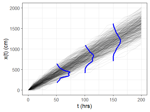
And that’s it! WAY easier than my old way. Note that if one of
your marginal distributions is a point (i.e. all values are identical,
such as x at time = 0 in the above dataset) you can get some
weird behavior
in the axis extents set by ggridges. If you don’t want to filter
out those instances from the marginal distribution data, you can always
work around the issue by manually setting the x-axis limits of the
plot using ggplot2::coord_cartesian().
Comments
Want to leave a comment? Visit this post's issue page on GitHub (you'll need a GitHub account).