One of the last projects I worked on before leaving HEC was exploring aleatory uncertainty in long-term river morphologic trends in the context of flood risk and project benefits. It should come as no surprise that changes in river morphology such as aggradation, erosion or bank migration can modify the effectiveness or capacity of structures such as levees, reservoirs and diversions. It’s really important to consider these processes when assessing project costs and benefits in morphologically-active systems, but it’s not easy to do; it takes a lot of model runs just to sample uncertainty in future hydrology, let alone uncertainty in sediment rating curves, transport equation, bank stability parameters, bed gradation, and a whole lot of other components.
You have to start somewhere though, and that somewhere is HEC’s Watershed Analysis Tool (HEC-WAT). The WAT is a model integration tool that allows multi-disciplinary teams in USACE offices to perform water resources studies. Will Lehman has been doing a lot of great work on this software, and one of his team’s more recent additions is a new plugin for continuous simulation that allows the WAT to run a hydrologic sampler in conjunction with HEC-RAS sediment transport models to generates multiple future hydrologic time series. This lets us evaluate how uncertainty in the magnitude and timing of future hydrology translates to uncertainty in the resulting morphological impacts. This information can then be used for assessing project benefits.
Having the ability to run literally hundreds of thousands of sediment
transport systems to sample uncertainty in future hydrology is great
and all, but you end up with literally thousands of gigabytes of data
to sort through. Developing a workflow for analyzing the data is no
less trivial than developing the workflow for simulation. Thankfully,
I’d already done a lot of work on that front. Throughout my time at HEC
I had been building a framework for mining the RAS HDF output files—an
R package I’m tentatively calling RAStestR—which actually did make
accessing the WAT results a trivial task.
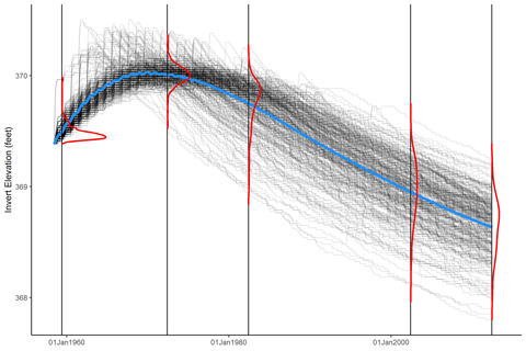
Stan and Will were excited to present the results of the WAT simulations, and they had a very specific figure in mind: A plot of all realizations, overlain with a mean trend and marginal distributions of the realizations at specific times. Stan had made plots like this before by hand in Excel (yikes) but we wanted to generate plots for every cross section, as well as for the longitudinal cumulative mass change and bed profiles. We needed an automated way to do this, and I was pretty sure I could figure out a way with R.
And I did, of course. Using ggplot2, of course. My strategy is
basically to generate a density curve using geom_density, then
extract the results, map it to the final plot’s y-scale, and draw
it as a line. I wrapped this up in the function marginal_densities,
and I’m fairly kinda sure-ish that I’m using the term correctly:
#' Marginal density plots
#'
#' Compute marginal densities on a variable and
#' map it to a different scale.
#'
#' @param data A data frame.
#' @param compute.on The data to compute densities over.
#' @param group.by A grouping variable specifying where to
#'   compute densities.
#' @param rescale.height Rescale density curves
#'   to a maximum height on the mapped scale.
#' @param trim Minimum density height to maintain at the left
#'   and right extremes of each density line. Accepts a single
#'   value or a two-element vector specifying left and right
#'   trim fractions, respectively.
#' @return A data.frame with columns `group`, `value`, and
#'   `density`.
marginal_densities = function(data, compute.on, group.by,
  rescale.height = 1, trim = 0) {
  temp = data[c(compute.on, group.by)]
  names(temp) = c("x", "group.name")
  temp = temp[order(temp$group.name),]
  all.groups = unique(temp$group.name)
  temp$group = factor(match(temp$group.name, all.groups),
    levels = 1:length(all.groups))
  p = ggplot(temp) + aes(x = x, group = group) +
    geom_density()
  gp = ggplot_build(p)
  d = gp$data[[1]]
  nd = data.frame(
    group = all.groups[match(d$group, 1:length(all.groups))],
    value = d$x,
    density = d$y
  )
  # rescale height
  nd$density = nd$group + rescale.max*nd$density/max(nd$density)
  # trim
	if (any(trim > 0)) {
    # ok, I haven't implemented this yet
  }
  nd
}
The function generates a data frame of density lines mapped to the x- and y-scales of the plot you actually want to place the densities on. Using this function, we can make awesome plots like this:
Since I can’t put a terabyte of HEC-RAS data up on this site to demonstrate the function, here’s a simple application to markov chain simulation:
library(tidyr)
library(ggplot2)
library(dplyr)

# markov chain parameters
mu = 8                           # cm/hr
sigma = 4                        # cm/sqrt(hr)
x0 = 3                           # initial condition
tmax = 200                       # end time
deltat = 10                      # time increment (hrs)
reps = 300                       # number of realizations

random_walk = function()
  c(0, cumsum(mu*deltat + sigma*rnorm(n, sd = deltat))) + x0

# simulate random walks
n = tmax/deltat
res = cbind.data.frame(seq(0,tmax, by = deltat), replicate(reps, random_walk()))
names(res) = c("time", paste("run", seq(1, ncol(res) - 1)))
# format the data for plotting
res.plot = gather(res, run, x, -time)
# extract specific times to compute marginal densities
res.select = filter(res.plot, time %in% c(50, 150))

# specify a maximum height of 25 hours
max.range = 25
marginal.data = marginal_densities(res.select,
  compute.on = "x", group.by = "time",
  rescale.max = 25)

# plot the results
ggplot(res.plot, aes(x = time, y = x, group = run)) +
  xlab("t (hrs)") + ylab("x(t) (cm)") + theme_bw() +
  # raw data
  geom_line(color = "black", alpha = 0.1) +
  # marginal densities
  geom_path(data = marginal.data,
    aes(x = density, y = value, group = group), color = "red", size = 1)
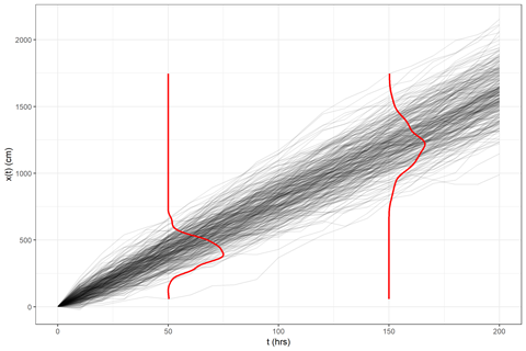
And that’s it! Obviously, there’s a little more to be done
to pretty it up, or even recode it as a geometry layer
(geom_marginal(), perhaps?). But I’ve got something that
works, and Stan and Will are spoiled for choice in how to
present our results.
Update
Since the marginal density lines are essentially the same as one-sided
violin plots, I made some simple modifications to geom_violin to
achieve the above results via a new geometry geom_marginal:
geom_marginal <- function(mapping = NULL, data = NULL,
                        stat = "ydensity", position = "dodge",
                        ...,
                        draw_quantiles = NULL,
                        trim = TRUE,
                        scale = "area",
                        na.rm = FALSE,
                        show.legend = NA,
                        inherit.aes = TRUE) {
  layer(
    data = data,
    mapping = mapping,
    stat = stat,
    geom = GeomMarginal,
    position = position,
    show.legend = show.legend,
    inherit.aes = inherit.aes,
    params = list(
      trim = trim,
      scale = scale,
      draw_quantiles = draw_quantiles,
      na.rm = na.rm,
      ...
    )
  )
}

GeomMarginal <- ggproto("GeomMarginal", Geom,
  setup_data = function(data, params) {
    if(is.null(data$width)){
      if(!is.null(params$width)){
        data$width <- params$width
      } else{
        data$width <- resolution(data$x, FALSE) * 0.9
      }
    }
    # ymin, ymax, xmin, and xmax define the bounding rectangle for each group
    plyr::ddply(data, "group", transform,
      xmin = x - width / 2,
      xmax = x + width / 2
    )
  },

  draw_group = function(self, data, ..., draw_quantiles = NULL) {
    # Find the points for the line to go all the way around
    data <- transform(data,
      xminv = x - 0 * (x - xmin),
      xmaxv = x + violinwidth * (xmax - x)
    )

    # Make sure it's sorted properly to draw the outline
    newdata <- #rbind(
 #     plyr::arrange(transform(data, x = xminv), y),
      plyr::arrange(transform(data, x = xmaxv), -y)
#    )

    # Close the polygon: set first and last point the same
    # Needed for coord_polar and such
#    newdata <- rbind(newdata, newdata[1,])

    # Draw quantiles if requested, so long as there is non-zero y range
    if (length(draw_quantiles) > 0 & !scales::zero_range(range(data$y))) {
      stopifnot(all(draw_quantiles >= 0), all(draw_quantiles <= 1))

      # Compute the quantile segments and combine with existing aesthetics
      quantiles <- create_quantile_segment_frame(data, draw_quantiles)
      aesthetics <- data[
        rep(1, nrow(quantiles)),
        setdiff(names(data), c("x", "y")),
        drop = FALSE
      ]
      aesthetics$alpha <- rep(1, nrow(quantiles))
      both <- cbind(quantiles, aesthetics)
      quantile_grob <- GeomPath$draw_panel(both, ...)

      ggplot2:::ggname("geom_marginal", grid::grobTree(
        GeomPath$draw_panel(newdata, ...),
        quantile_grob)
      )
    } else {
      ggplot2:::ggname("geom_marginal", GeomPath$draw_panel(newdata, ...))
    }
  },

  draw_key = draw_key_path,

  default_aes = aes(weight = 1, colour = "grey20", fill = NA, size = 0.5,
    alpha = NA, linetype = "solid"),

  required_aes = c("x", "y")
)

# Returns a data.frame with info needed to draw quantile segments.
create_quantile_segment_frame <- function(data, draw_quantiles) {
  dens <- cumsum(data$density) / sum(data$density)
  ecdf <- stats::approxfun(dens, data$y)
  ys <- ecdf(draw_quantiles) # these are all the y-values for quantiles

  # Get the marginal bounds for the requested quantiles.
  marginal.xminvs <- (stats::approxfun(data$y, data$xminv))(ys)
  marginal.xmaxvs <- (stats::approxfun(data$y, data$xmaxv))(ys)

  # We have two rows per segment drawn. Each segment gets its own group.
  data.frame(
    x = ggplot2:::interleave(marginal.xminvs, marginal.xmaxvs),
    y = rep(ys, each = 2),
    group = rep(ys, each = 2)
  )
}
Try it out!
ggplot(res.plot, aes(x = time, y = x, group = run)) +
  xlab("t (hrs)") + ylab("x(t) (cm)") + theme_bw() +
  # raw data
  geom_line(color = "black", alpha = 0.1) +
  geom_marginal(data = res.select, aes(group = time), color = 'red')
Comments
Want to leave a comment? Visit this post's issue page on GitHub (you'll need a GitHub account).