One thing I love is to do is make data beautiful. Seriously, I can spend hours playing with plot designs. When you have lots of data, or data with multiple dimensions, it can be challenging to visualize it in a way that is intuitive and meaningful. In addition, making complex plots or using multiple data layers often requires clumsy syntax (I’m looking at you, Matlab).
Enter the ggplot2 package for R. The ggplot2 package is based on the grammar of graphics, which I haven’t bothered to read (sorry!). The package provides a framework for mapping your data to visualizations using a formal structure, meaning that you can easily try out different plotting techniques without making any changes to the underlying data. It also structures the plot aesthetics so that it’s obvious when you’re using redundant visual effects (e.g. making line color and dash type change with the same categorical variable). While there’s a bit of a learning curve, once you get the hang of plotting with ggplot2 you’ll never look back. There’s a wealth of documentation that will get you started making simple plots, and StackOverflow is, well, overflowing with solutions to the more complicated plot designs.
I’m not going to rehash a ggplot2 tutorial here; rather, I’m going to show off some of the cool graphics I’ve made with it, along with the code I used to do it. The examples are intended to point out methods for addressing some common plotting needs. Enjoy!
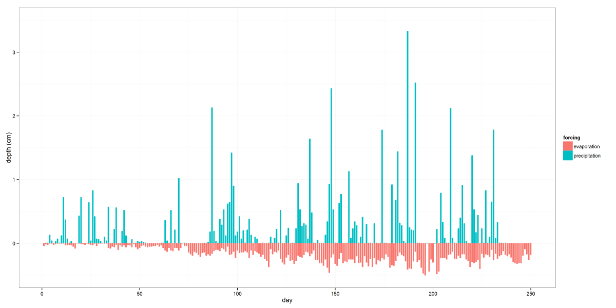
The above image shows some atmospheric boundary conditions used in a class project. This is a pretty simple graph, but the use of data subsets in the code below shows how easy it is to pick out bits of a dataset for plotting without creating a whole new dataframe. (edit: it turns out using subset is a really bad idea.) While most normal people would just use the the group aesthetic and not bother subsetting the data, I wanted to prevent precipitation and evaporation columns from being plotted side-by-side and instead have them look like two sides of the same bar. Another thing to notice is the use of melt from the reshape2 package. You’ll find it invaluable for formatting your plot data to take advantage of ggplot2’s aesthetic mapping capabilities.
atmosbc <- read.csv("atmosphereBC.csv")
names(atmosbc) <- c("day", "precipitation", "evaporation")
atmosbc["evaporation"] = atmosbc[["evaporation"]]*-1
atmos <- melt(atmosbc, id.vars="day",
              measure.vars=c("evaporation", "precipitation"))
names(atmos) <- c("day", "forcing", "value")
plotatmos <- ggplot(atmos, aes(x=day, y=value, color=forcing, fill=forcing)) +
             geom_bar(data=subset(atmos, forcing=="precipitation"),
                      stat="identity", position="dodge", width=0.5) +
             geom_bar(data=subset(atmos, forcing=="evaporation"),
                      stat="identity", position="dodge", width=0.5) +
             theme_bw() + xlab("day") +
             scale_y_continuous("depth (cm)", limits=c(-0.5, 3.5))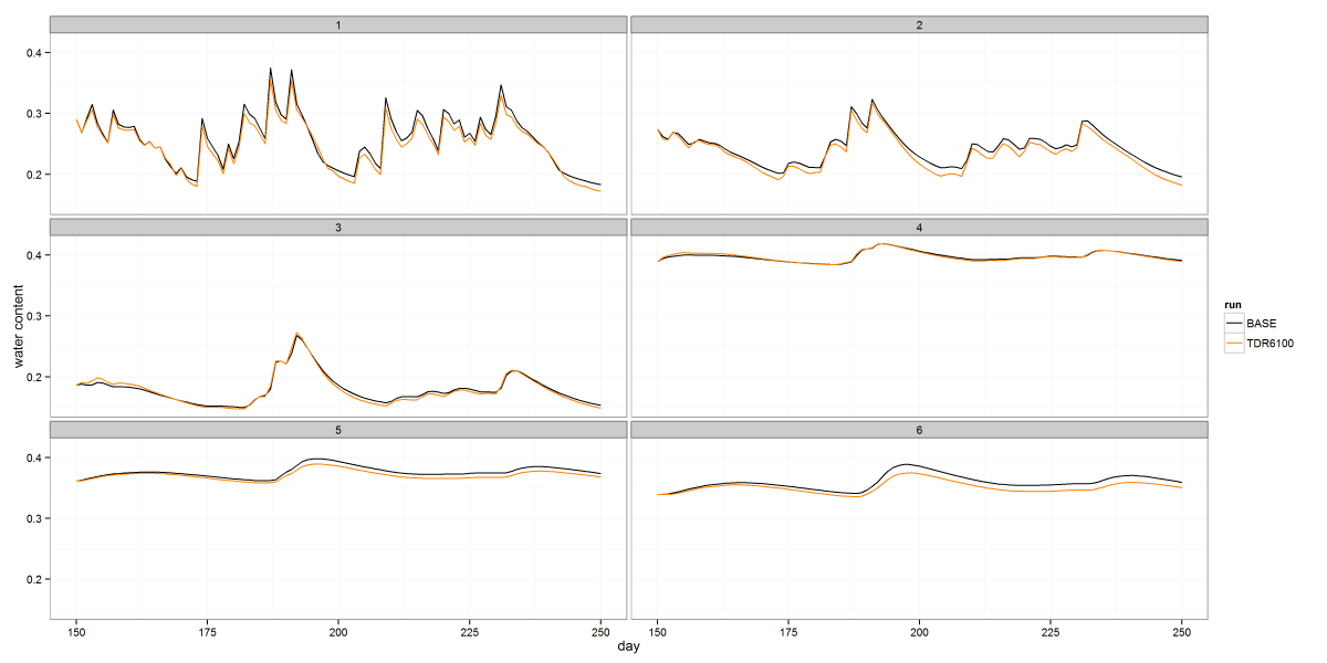
The image above shows soil moisture timeseries from a class project, faceted by depth. The code below illustrates how to use facets to arrange your data in a grid. In this case I only gridded it by one variable, but you can grid in two directions by passing a complete formula to facet_wrap. The color stuff at the beginning shows how to define a consistent color map if you intend to create multiple plots of the same groups of data and want to maintain a unique color for each group.
myColors <- brewer.pal(5, "Set1")
myColors[1] <- "#000000"
names(myColors) <- c("BASE", "TDR3200", "TDR6200", "TDR3100", "TDR6100")
colScale <- scale_colour_manual(name="run",values=myColors)
sr6last100 <- read.csv(srpath6100)
sr6last100["subregion"] <- factor(sr6last100[["subregion"]])
sr6last100ts <- melt(sr6last100, id.vars=c("day", "subregion"),
                       measure.vars=c("BASE", "TDR6100"))
names(sr6last100ts) <- c("day", "subregion", "run", "wc")
plot6100ts <- ggplot(sr6last100ts, aes(x=day, y=wc, color=run)) +
              geom_line() + facet_wrap(~ subregion, nrow=3) +
              theme_bw() + ylab("water content") + colScale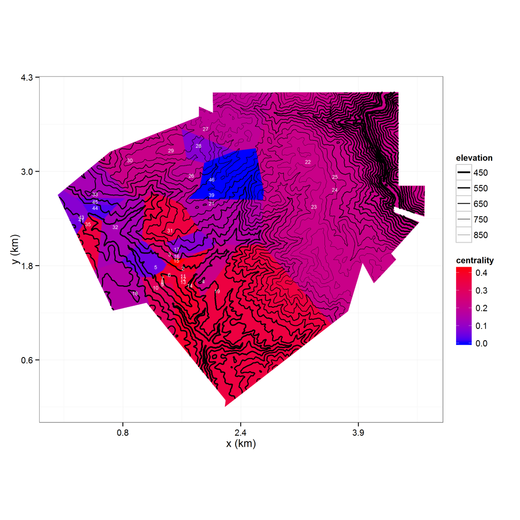
There’s a lot going on in the above image, so let’s step through it carefully. The image shows an elevation contour map overlaying a Thiessen polygon map of observation nodes (labeled in white). The polygons are colored by the degree centrality (a graph-theoretic measure) of its node. A lot of the code needed to process the data is not related to ggplot2 so I won’t dive into it here, but you can find it on my R repository. Things of note are the use of the r.Matlab package to access .mat files and the rgdal package for reading in a shape file (in this case, the boundary for the polygon set). The voronoipolygons function I use to develop the Thiessen polygons was sourced from Carson Farmer’s blog post and modified based on a related post on Stack Overflow. Finally, I use ggplot2’s fortify function to convert the SpatialPolygonsDataFrame into a data frame I can use for plotting.
Now let’s go over the ggplot2 stuff, which I have included code for.The plot consists of an elevation grid, a polygon layer, and point coordinates with labels. The elevation grid is plotted as a contour map using geom_contour, while the Thiessen polygons are plotted using geom_polygon. I plot the observation locations as text labels instead of points by using geom_text. As you can see from the code, layering these plots is trivial. The function at the beginning of the code is a scale transformation I use to convert feet to kilometers, and I use coord_fixed to make sure my map is plotted proportionally. In addition to my own color scale for the polygon fill colors, I use a custom size scale to make the lower elevation contours thicker than the higher elevation contours. To improve readability, I store my plot’s axis labels, theme and scales as a list and add them all at once instead of using typing each one inline.
# axis transformation
kmscale <- function(offset=0){
 function(x) format((x - offset)*0.3048/1000, digits=1)
}

# dem is an elevation model of the region
# names(dem) = c('projx', 'projy', 'z')
# vn is a fortified SpatialPolygonsDataFrame
# names(vn) = c('nodeid', 'group', 'projx', 'projy', 'centrality')
miny <- min(as.data.frame(dem)$projy)
minx <- min(as.data.frame(dem)$projx)
opts <- vector("list", length=6)
opts[[1]] <- coord_fixed()
opts[[2]] <- theme_bw()
opts[[3]] <- scale_y_continuous(name="y (km)", labels=kmscale(offset=miny))
opts[[4]] <- scale_x_continuous(name="x (km)", labels=kmscale(offset=minx))
opts[[5]] <- scale_fill_gradient(low="blue", high="red")
opts[[6]] <- scale_size('elevation', range=c(1, 0.1))
voronoiplot <- ggplot(vn, aes(x=projx, y=projy) ) +
               geom_polygon(aes(fill=centrality, group=group)) +
               geom_contour(data=as.data.frame(dem),
                            aes(z=z, size=..level..),
                            binwidth=25, color='black') +
               geom_text(data=as.data.frame(nodes),
                         aes(x=projx, y=projy, label=id),
                         size=2, color="white") +
               opts
Neat stuff, huh? You can expect more ggplot2 posts in the future.
Comments
Want to leave a comment? Visit this post's issue page on GitHub (you'll need a GitHub account).